Full disclosure: this post is sort of cheating, in that I’m really just focusing on one artist and not making connections beyond her work. But seeing as this whole series is idiosyncratic, and also seeing that the work itself makes any number of connections, I’m not going to worry about it.
I went to the Fabric Workshop and Museum and saw the Sarah Sze installation. I didn’t know anything about Sarah Sze’s work, but after a long stretch of travel and convening, a museum seemed like the right place to go, and this one happened to be both conveniently located and open.
I put down my bulky coat to take pictures. Thought about taking a picture of my coat on the floor next to this coat, adding an element to the installation, but didn’t.
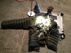
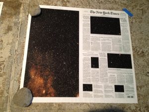
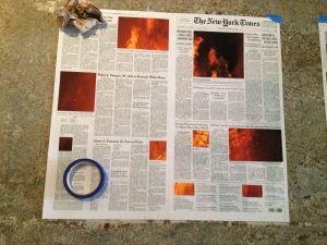
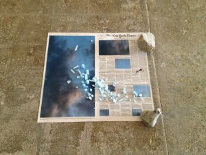
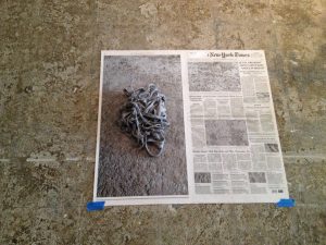
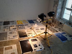
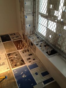
In this part of the installation, Sze used a lot of newspaper pages, replacing the photos on each with pictures of timeless, elemental substances — snow, water, ice, wood, rocks, sky, fire — sometimes with other items placed on top.
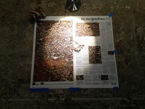
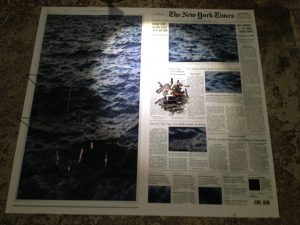
I particularly liked this one, the circular blue painter’s tape contrasting with the squares & rectangles of flame.
And this one, rocks and sky and light blue shards of…what? Not sure, but I love its placement.
She clearly seemed to be incorporating the floor into the installation as well; its colors & textures acting as a frame/background.
I can’t really convey the overall scale, but here are a few photos that give something of a sense of it:
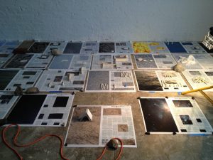
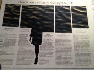
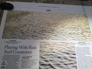
Two elements of the installation struck me the most solely because of my connection-craving brain. I asked the guide if there was any deliberate relationship between the articles in the newspapers and the images with which Sze replaced the accompanying photos. Apparently not; but these two juxtapositions of headlines & images worked especially well for me:
“There’s Lots to Gain by Keeping It Simple”
“Playing With Risk And Constraint”
“
And I highly recommend this PBS video: Sze describing & showing some of her other work.
